Posted on Aug 30, 2008
Some of you with a sharp eye might have noticed something very interesting on-screen during the Windows 7 multi-touch demonstration at the D6 conference yesterday. If you did, you might be curious to understand what you saw. If you didn’t, read on anyway. Update: The new taskbar is superficially called the “Superbar”.
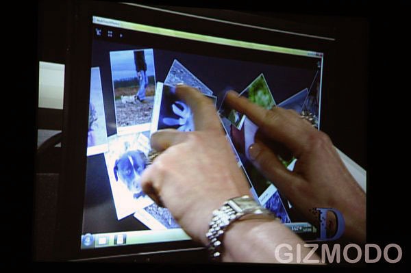
The picture above comes from the video feed of Julie Larson Green’s (Vice President of Windows Experience Program Management) demo of the multi-touch picture browser demo app. The quality is a little rough, but you can easily notice a few things that are different.
The first being the taskbar is higher than usual, but not as big as double-height. If I were to guess, I’d say its somewhere around 1.75x-high. In the left corner, the Windows orb remains wedged “on top” of the taskbar - sticking its head out a little - instead of in the center like it is today in Vista.
The taskbar also appears ‘divided’ into sections by variations in the color (dark, gray, lighter) to indicate the different areas. Speaking of which, if you look at the far right corner, you’d notice that the tray (icons & clock) is not touching the edge of the screen, and there’s a small lighter gap. I have no explanation for this, but is well worth keeping an eye on.

A double-height taskbar in Windows Vista
Keeping the focus on the right, the tray is also different. The icons sit in the middle of the taskbar, instead of wrapping in two-lines like it does today, whilst the date now wraps on two lines instead of three. This clearly indicates this taskbar cannot accommodate three lines of text........continue reading
0 comments:
Post a Comment
U have comments